
A project’s colour strategy is rarely locked in once at the concept stage and left untouched. It unfolds across dozens of detailed material decisions, from workstation laminates to boardroom upholstery, where each specification either reinforces the intended spatial psychology or quietly undermines it.
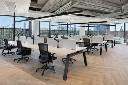
A subtle shift in colour temperature between a collaborative hub and a quiet focus zone provides intuitive spatial wayfinding without relying on physical partitions or signage.
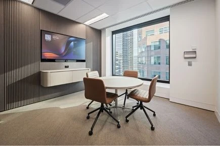
Receptions and breakout spaces suit warmer, richer tones that put visitors and staff immediately at ease. Spaces dedicated to deep concentration benefit from cooler, muted palettes that recede visually.
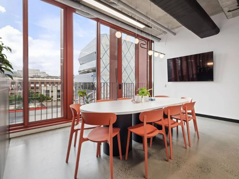
A single, confident accent—on a feature chair, acoustic wall panel, or joinery run—reads as intentional. Scattering multiple accent colours across a single room creates visual friction, regardless of how cohesive individual swatches look on a tray.
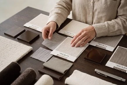
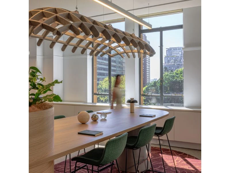
Fabrics, laminates, and timber veneers must be specified as an integrated system. A palette that appears resolved on a sample board can easily break down when physical materials sit side by side under actual site lighting.
Colour and Light Cannot Be Separated
In commercial architecture, colour rendering describes how accurately an artificial light source reveals the true shade and depth of a physical finish. A colour scheme is only as performant as the illumination above it.
The WELL Building Standard’s Light concept mandates strict performance thresholds for electric light quality because poor CRI (Colour Rendering Index) sources distort the very palette a design team spends months refining (International WELL Building Institute, 2026). For example, a rich timber veneer under cool, low-quality LED lighting can appear flat or sickly green, completely neutralising a premium material specification.
While lighting performance metrics rarely feature in early client pitch decks, they ultimately dictate whether a built environment lives up to its 3D renders. Specifying lighting and material finishes in tandem, rather than sequentially, eliminates aesthetic risk before it becomes an expensive on-site rework.
The Theory Behind the Palette
Josef Albers, whose 1963 landmark text Interaction of Colour remains a foundational reference in design, established that colour is never absolute; its perceived value changes entirely depending on adjacent finishes (Albers, 2013). A neutral grey placed against crisp white feels cool, yet that same grey reads as distinctly warm when bordered by deep blue.
Similarly, a warm timber tone that anchors a space next to off-form concrete can feel muddy beside an adjacent wood species with a slightly different undertone. This phenomenon explains why colour choices made on isolated swatches so often underwhelm once installed against site-specific flooring, ceiling grids, and shifting daylight.
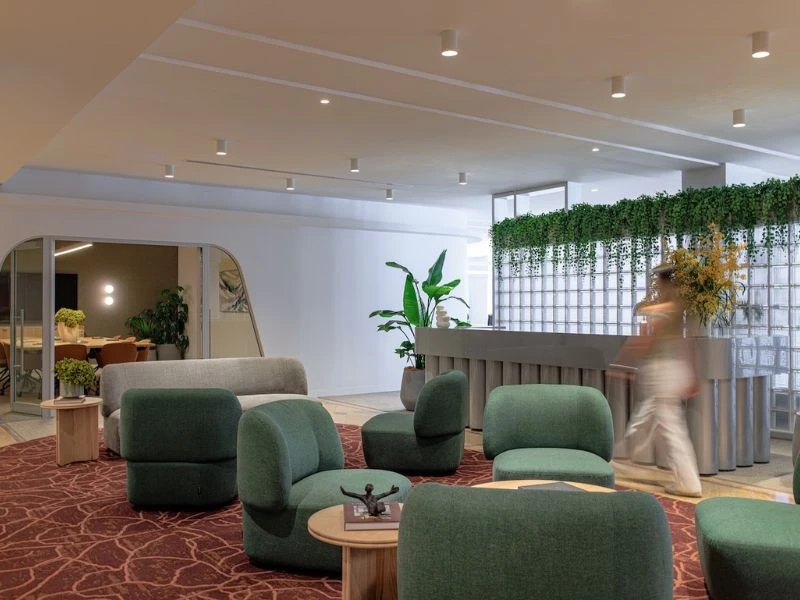
Nature offers a far more reliable baseline. Palettes derived from stone, timber, and native foliage leverage what biophilic design research categorises as natural analogues—one of the most consistently restorative material approaches available to designers (Terrapin Bright Green, 2024). It is also why the natural variation inherent in real timber veneer is something to design around rather than attempt to flatten or disguise.
What Does Colour Have to Do with Inclusive Design?
Neuroinclusive colour design is the practice of using low-contrast, muted palettes to reduce sensory overload and support cognitive comfort across diverse neurotypes.
Colour is a baseline wellbeing consideration, not merely an aesthetic preference. British standards for neurodiversity in the built environment recommend muted, low-contrast palettes across shared work settings, treating colour as one component of an integrated sensory strategy alongside acoustic attenuation and circadian lighting (British Standards Institution, 2022).
Sensory processing differences make vibrant, high-contrast schemes exhausting to filter out over an eight-hour workday.
Bold tones and expressive patterns sit far more comfortably in spaces people choose to visit, such as a breakout lounge, than in circulation paths they must navigate to reach a desk.
Gradual tonal shifts support spatial orientation, whereas sudden, high-contrast boundaries cause visual fatigue and disorientation.
Commercial Strategy Note
Designing a calmer, sensory-considered workplace isn't a compromise made for a minority of staff. It delivers an intuitive, low-friction environment where every employee can settle in and focus.
Where Colour Is Heading in 2026
Dulux’s 2026 Colour Forecast highlights a decisive shift away from the stark, cold greys of the past decade, leaning instead toward grounded warm neutrals, earthy clays, and restorative greens across its Ethereal, Elemental, and Evoke palettes (Dulux, 2026). Design leaders interviewed by Dezeen reflected a similar direction, noting a transition away from spaces built for immediate visual impact toward long-term visual longevity (Dezeen, 2026).
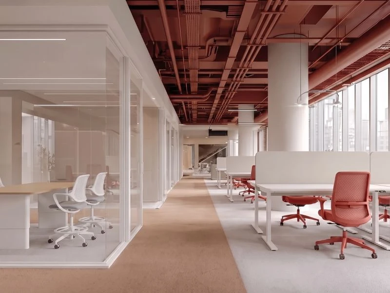
For commercial fit-outs, the objective isn't to copy residential trends wholesale, but to adopt their underlying logic:
Yields high commercial longevity. A considered neutral envelope with targeted, replaceable accent elements allows a commercial asset to age gracefully.
Leads to rapid visual obsolescence. A boardroom wrapped entirely in a transient "colour of the year" will look dated long before the lease expires.
Designing with Colour That Performs
At Krost, we treat colour as an essential line item in the functional brief. Our portfolio of commercial seating, tables, and spatial division solutions, supported by local manufacturing and custom upholstery, gives architects, designers, and business owners the agility to test palettes against real finishes before committing.
Tools like our Virtual Pinboard on krost.com.au streamline early-stage specification, letting project teams curate, compare, and refine finish combinations well before samples arrive on site.